COLORS FROM PHOTO
We’ve given this design a harmonious, professional look by automatically basing the theme colors on the main colors of the header photo.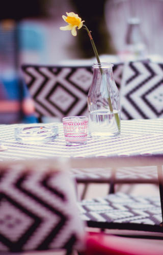
ANIMATIONS
Check out the animations, including ‘on reveal’ effects such as these 3 photos that fade in, and the ‘demo site’ banner at the top that fades in as it scrolls down.
STRETCHING HEADINGS
The header photo stretches to the full width of the screen. In the mobile variant it also sticks to the top of the page when you scroll down.
Find out more @
www.xara.com
Gaddesden Place, United Kingdom
© Xara 2019


WELCOME to web design with Xara
This website site was created with the latest version of Web Designer, using the ‘Auberge’ hotel website theme. It demonstrates the new
‘scale to fit width’ feature, as well as many other recent additions to the web design toolkit. This design has two variants (mobile and
main) and the fit to width option smoothly scales the contents within each variant, ensuring a better result for a wider variety of devices,
and a smoother, more fluid transition within variants. Vary the width of your browser window to see how it works.
“This is the easiest and most comprehensive way
to build modern looking responsive websites
without code.”


COLORS FROM PHOTO
We’ve given this design a harmonious, professional look by automatically basing the theme colors on the main colors of the header photo.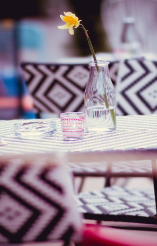
ANIMATIONS
Check out the animations, including ‘on reveal’ effects such as these 3 photos that fade in, and the ‘demo site’ banner at the top that fades in as it scrolls down.
STRETCHING HEADINGS
The header photo stretches to the full width of the screen. In the mobile variant it also sticks to the top of the page when you scroll down.
Find out more @
www.xara.com
Gaddesden Place, United Kingdom
© Xara 2019
WELCOME
to web
design with
Xara
This website site was created with the
latest version of Web Designer, using
the ‘Auberge’ hotel website theme. It
demonstrates the new ‘scale to fit
width’ feature, as well as many other
recent additions to the web design
toolkit. This design has two variants
(mobile and main) and the fit to width
option smoothly scales the contents
within each variant, ensuring a better
result for a wider variety of devices,
and a smoother, more fluid transition
within variants. Vary the width of your
browser window to see how it works.
“This is the easiest and
most comprehensive
way to build modern
looking responsive
websites without code.”


XARA DEMO SITE
The latest version of Xara Web
Designer and Designer Pro
include enhanced support for
responsive sites like this one,
Check out this demo!


