


The latest Xara Web Designer and Xara Designer Pro
include enhanced support for Responsive Web Design.
This page is an example that demonstrates many of the
features required to create a modern, mobile-friendly
website, incorporating animation effects, automatic
Retina (HiDPI) photos and graphics, wide-screen and
narrow screen variants, mobile friendly navigation and,
mobile specific text styles and more.
Key features:
•
Fluid resizing of the page to best-fit any width
screen, with a max-size limit.
•
Two responsive variants, one for narrow mobile
screens, one for wider screens.
•
Automatic responsive graphics and photos for hi-
res screens. (HiDPI or Retina screens.)
•
Stretchy banner photo and top nav bar.
•
Various animation effects on mouse-over, click or
reveal.
•
Packed photo grid with pop-up photo gallery.
•
Mobile specific text styles (larger fonts).
•
Color Scheme based on the color of the banner
photo.
Some of these features are described below.
Mobile and Wide-screen variants
Modern websites have to be optimized for mobile screens which are physically smaller and at higher resolution. So a font size, say 13px, which might be perfectly readable on a desktop, is too small for a mobile screen. This example document has a Normal text style (at 100% scale) that is 15px for desktop and 20px for mobile devices. Secondly desktop screens have enough width to support photos or other media being placed beside the main text (like on this page), whereas with mobile screens this content should be arranged differently - typically in one narrow column. Xara Designer allows you to create different layouts for different devices, and yet share the content. So this text is identical on both the mobile and wide screen variant - editing the text in one variant updates it in the other.Fluid resize:
The new version of Xara Designer supports fluid scaling within variants, to ensure your web page resizes for the best fit possible for any browser width, mobile, tablet or desktop. You can see this in action by adjusting the width of the browser for this page. Below a set page width (sometimes called the ‘breakpoint’) it switches to the mobile variant. Importantly for very large desktop screen, you can set a maximum width to ensure your text does not grow to be unreasonably large. This document has a 1280px max width. You’ll see as you make the browser width wider, everything scales up in a fluid manner, up to a width of 1280px, at which point the main content gets no larger. The exception in this design is the NavBar header and banner photo which are set to stretch, so these continue to stretch to any width. Below the Mobile width breakpoint, you’ll see the mobile version also fluidly scales the width, which means the content will best-fit any narrow screen device your site visitor might be using.Automatic HiDPI graphics and photos
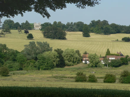
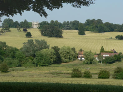
Part of the Responsive Web Design tool-kit is the ability to use the best resolution graphics and photos for the device being used to view your website. Modern mobiles and tablets tend to use very high resolution screens, where normal resolution graphics (96dpi) look poor or blurry. So for these devices Xara can automatically create HiDPI photo and graphics (JPGs and PNGs). But because the images are twice the resolution, the file size is sometimes up to four times larger (typically 3x larger). If we used these images on a normal resolution device, say a desktop browser, this would mean 3 times slower load times. So we do not want hi-resolution images displayed on normal resolution screens. Xara Web Designer is smart in that it not only automatically creates the right resolution, but uses the right image for the right device, maximising quality for hi-res devices and performance for normal resolution devices.


This PhotoGrid is set to have a soft reveal so it fades in
as the page appears. The images are set to have pop-
up large images (click to show the pop-up gallery).
You can set the pop-up size to be any required size.
Xara intelligently creates high resolution (HiDPI) version
for maximum quality on mobile and hi-res screens.
The latest Xara Web Designer and Xara
Designer Pro include enhanced support for
Responsive Web Design.
This page is an example that demonstrates
many of the features required to create a
modern, mobile-friendly website, incorporating
animation effects, automatic Retina (HiDPI)
photos and graphics, wide-screen and narrow
screen variants, mobile friendly navigation and,
mobile specific text styles and more.
Key features:
•
Fluid resizing of the page to best-fit any
width screen, with a max-size limit.
•
Two responsive variants, one for narrow
mobile screens, one for wider screens.
•
Automatic responsive graphics and photos
for hi-res screens. (HiDPI or Retina screens.)
•
Stretchy banner photo and top nav bar.
•
Various animation effects on mouse-over,
click or reveal.
•
Packed photo grid with pop-up photo
gallery.
•
Mobile specific text styles (larger fonts).
•
Color Scheme based on the color of the
banner photo.
Some of these features are described below.
Mobile and Wide-screen variants
Modern websites have to be optimized for mobile screens which are physically smaller and at higher resolution. So a font size, say 13px, which might be perfectly readable on a desktop, is too small for a mobile screen. This example document has a Normal text style (at 100% scale) that is 15px for desktop and 20px for mobile devices. Secondly desktop screens have enough width to support photos or other media being placed beside the main text (like on this page), whereas with mobile screens this content should be arranged differently - typically in one narrow column. Xara Designer allows you to create different layouts for different devices, and yet share the content. So this text is identical on both the mobile and wide screen variant - editing the text in one variant updates it in the other.Fluid resize:
The new version of Xara Designer supports fluid scaling within variants, to ensure your web page resizes for the best fit possible for any browser width, mobile, tablet or desktop. You can see this in action by adjusting the width of the browser for this page. Below a set page width (sometimes called the ‘breakpoint’) it switches to the mobile variant. Importantly for very large desktop screen, you can set a maximum width to ensure your text does not grow to be unreasonably large. This document has a 1280px max width. You’ll see as you make the browser width wider, everything scales up in a fluid manner, up to a width of 1280px, at which point the main content gets no larger. The exception in this design is the NavBar header and banner photo which are set to stretch, so these continue to stretch to any width. Below the Mobile width breakpoint, you’ll see the mobile version also fluidly scales the width, which means the content will best-fit any narrow screen device your site visitor might be using.Automatic HiDPI graphics and photos
Part of the Responsive Web Design tool-kit is the ability to use the best resolution graphics and photos for the device being used to view your website. Modern mobiles and tablets tend to use very high resolution screens, where normal resolution graphics (96dpi) look poor or blurry. So for these devices Xara can automatically create HiDPI photo and graphics (JPGs and PNGs). But because the images are twice the resolution, the file size is sometimes up to four times larger (typically 3x larger). If we used these images on a normal resolution device, say a desktop browser, this would mean 3 times slower load times. So we do not want hi-resolution images displayed on normal resolution screens. Xara Web Designer is smart in that it not only automatically creates the right resolution, but uses the right image for the right device, maximising quality for hi-res devices and performance for normal resolution devices.